Brand & identity.
Everything you need to use our mark correctly — logos, colors, typography, social cards, and app icons. Built around a single object: a small, weighted sphere, floating on cream.
One sphere. Three contexts.
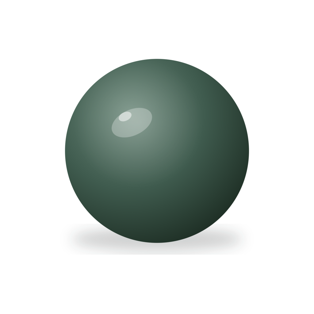
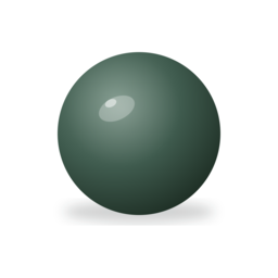
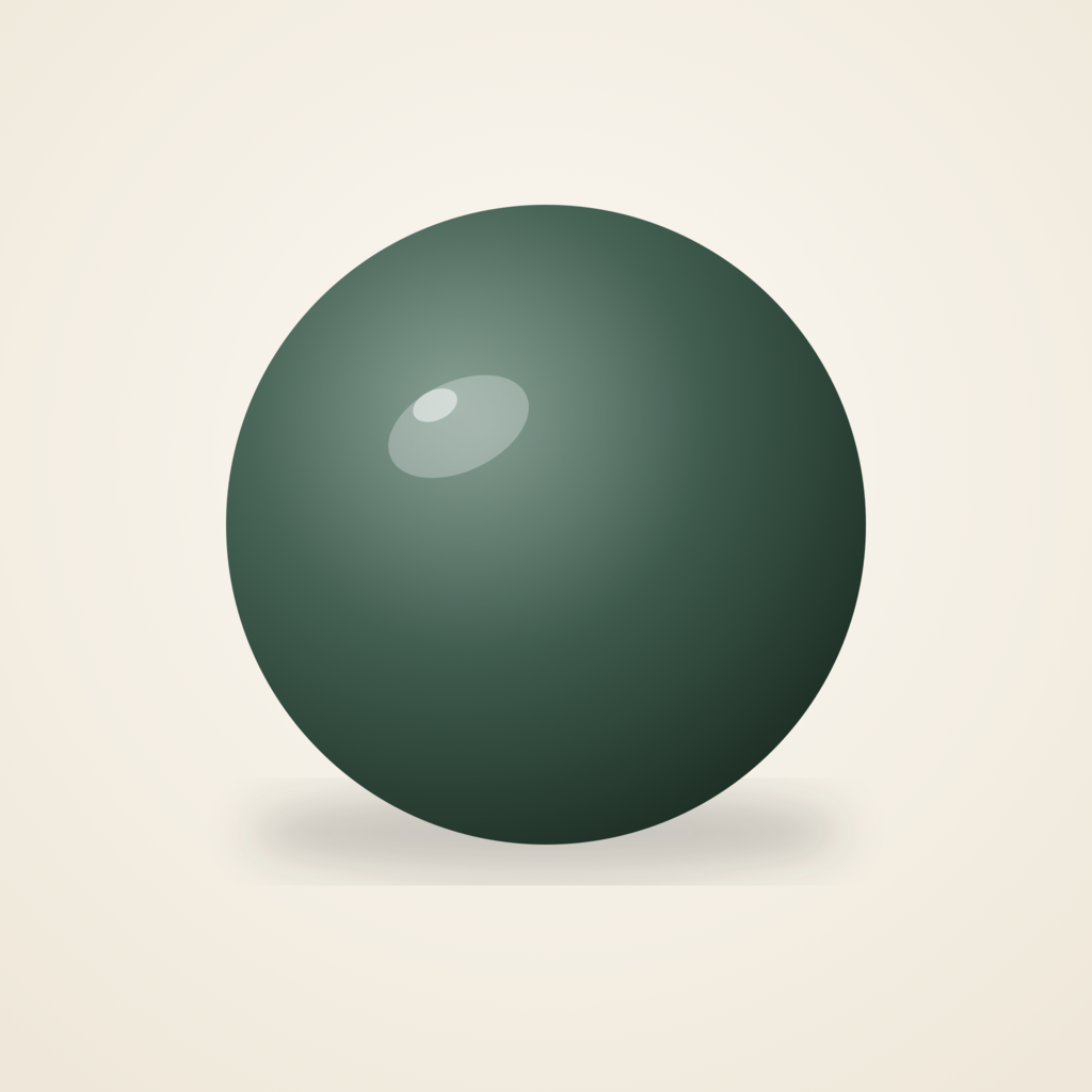
The primary mark is a soft-shaded sphere — modelled to feel like a small stone weighted in your palm. It lives against cream in most product surfaces, with a forest-ground variant for dark backgrounds and a transparent master for flexible placement.

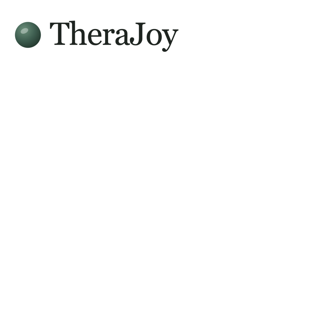
Sphere + name, lockup.
When we need the name read alongside the mark, we lock them at a 1:1.55 ratio (sphere centered to the cap-height of "T"). Use on a single line only — never stacked.
Give it room to breathe.
Maintain clear space equal to ¼ of the mark's width on all sides. Nothing — text, graphic, edge, container — should cross inside that boundary.

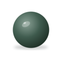
Minimum sizes
App icon: 29 pt / 58 px — iOS Settings row minimum.
Favicon: 16 px — readability still holds at tab-strip size.
Print: 14 mm / 0.55 in. Smaller than that, the specular highlight and shadow start to mud-out.
Placement
Prefer a floating composition — the mark sits within its own negative space. Avoid tight corners, edges, or busy photographic grounds.
A palette of rooms, not buttons.
Built to recede. Paper and bone carry most surfaces; forest is used sparingly for primary actions and accents. The sphere's own gradient uses three stops drawn from the forest family.
Serif for feeling. Sans for facts.
Two families, sharply separated. Serif carries the emotional voice — taglines, headers, the name of the thing. Sans handles anything procedural — UI controls, specs, metadata.
App icon, touch icon, favicons.
Ready-cut PNGs at every common OS size. The app icon is iOS's single-asset 1024 × 1024 format (iOS 17+) that the system scales for Home, Settings, Spotlight, and Notifications.
<!-- Paste into <head> -->
<link rel="icon" href="/img/brand/favicon.ico"/>
<link rel="icon" type="image/png" sizes="32x32" href="/img/brand/therajoy-favicon-32.png"/>
<link rel="icon" type="image/png" sizes="16x16" href="/img/brand/therajoy-favicon-16.png"/>
<link rel="apple-touch-icon" href="/img/brand/therajoy-apple-touch-icon.png"/>
<meta property="og:image" content="/img/brand/therajoy-og-1200x630.png"/>
<meta name="twitter:card" content="summary_large_image"/>
<meta name="twitter:image" content="/img/brand/therajoy-twitter-1600x900.png"/>
Do & don't.
The mark is built on a specific weight, gradient, and shadow. Modifying any of the three breaks the object-ness of the sphere.
Keep it floating
Let the contact shadow sit 18 pt below the sphere. The shadow is what makes it read as weighted.
Use the exact gradient
3-stop radial: #6F8B7D → #3F5B4E → #1F3026. Center at (35%, 30%). Don't substitute flat color.
Keep the specular highlight
The small white ellipse at upper-left is the life of the object. Don't remove it, even at tiny sizes.
Don't skew or squash
The sphere is circular. Non-uniform scaling breaks the illusion — it becomes an egg.
Don't add a stroke
The mark has no outline. Outlines flatten the dimensionality we worked to build.
Don't recolor
No rainbow sphere for Pride, no pink sphere for Breast Cancer Awareness. The sphere has one identity.
Quiet. Specific. Not clinical.
We're talking to someone sitting alone with something hard. The copy earns permission by being small — plain words, short sentences, no performance of expertise.
Plain over clinical
Gentle over prescriptive
Specific over generic
Honest over promotional
The complete kit.
Every asset on this page, bundled. SVGs, PNGs, favicons, social cards, app icons, the whole library.
Questions about using the mark — licensing, partnership, press? Get in touch. For legal, including permitted and prohibited uses, see our terms.
Open Graph & share cards.
Pre-rendered cards for link previews. Paper ground, right-aligned sphere, serif copy. Suitable drop-in for Open Graph, Twitter/X, and LinkedIn.